 Is there any method to determining a bad game? Are scores assigned by taking
away points for each mistake the designer makes? In simple terms, no. If you wonder why,
look at this abomination, Moto Cross Championship. Regardless of the scoring
scale given to it, there's no fair way to assess the situation and keep those numbers in
the positive.
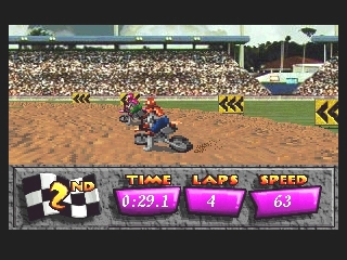
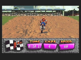
 No pun intended, right from the starting line things go wrong. The mass of fluorescent pixels mash together in an ugly mess, immediately losing the player's rider. That of course comes after navigating the meager menus, which only offer practice runs, multi-player, and season options (via password).
Even deeper onto the track, things continue to get worse. Taking corners would not be a challenge at all if it weren't for the oversized roster. Just barely rear-ending someone brings you to a halt (along with a loud and annoying "Hey!" every time it happens), and the same thing happens if they hit you. That's just not logical.
Pop-up makes it difficult to determine what's coming next, and the audio, with an obnoxious attempt at making a heavy metal backdrop, only make this more difficult to bear. Two players battling in a horizontal split screen both have a status bar, which provides nothing actually useful, and only takes up valuable space.
 There are no tricks to perform, so catching air doesn't have any benefit.
Besides turning, the only thing else you can do is punch and kick. Even hitting full
speed, this game finds a way to be boring. There are games released 10-years prior that
have more depth, or at least tried to.
There are no tricks to perform, so catching air doesn't have any benefit.
Besides turning, the only thing else you can do is punch and kick. Even hitting full
speed, this game finds a way to be boring. There are games released 10-years prior that
have more depth, or at least tried to.Considering just how bad some of the software ended up on the 32X, it's hard to say if this is the game that will cause you the most pain. It's definitely near the bottom regardless. Not only does it fail to give a reason as to why you should a buy a 32X to play it, even on the Genesis it wouldn't be impressive.